
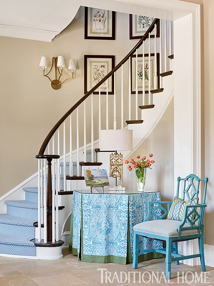
IMPACTFUL AND INVITING ENTRYWAYS/ FOYERS
Many of our older homes have an inviting entry area. It is the first impression for guests so it needs to reflect the style and feeling of the home. Although the entryway in this Traditional Home Magazine is neutral we can add design accents to make it a true welcome to this home. The designer/ client has chosen soft turquoise as the accent color. And yes, we can embroider on this single tone creating a more impactful feeling to the entry.
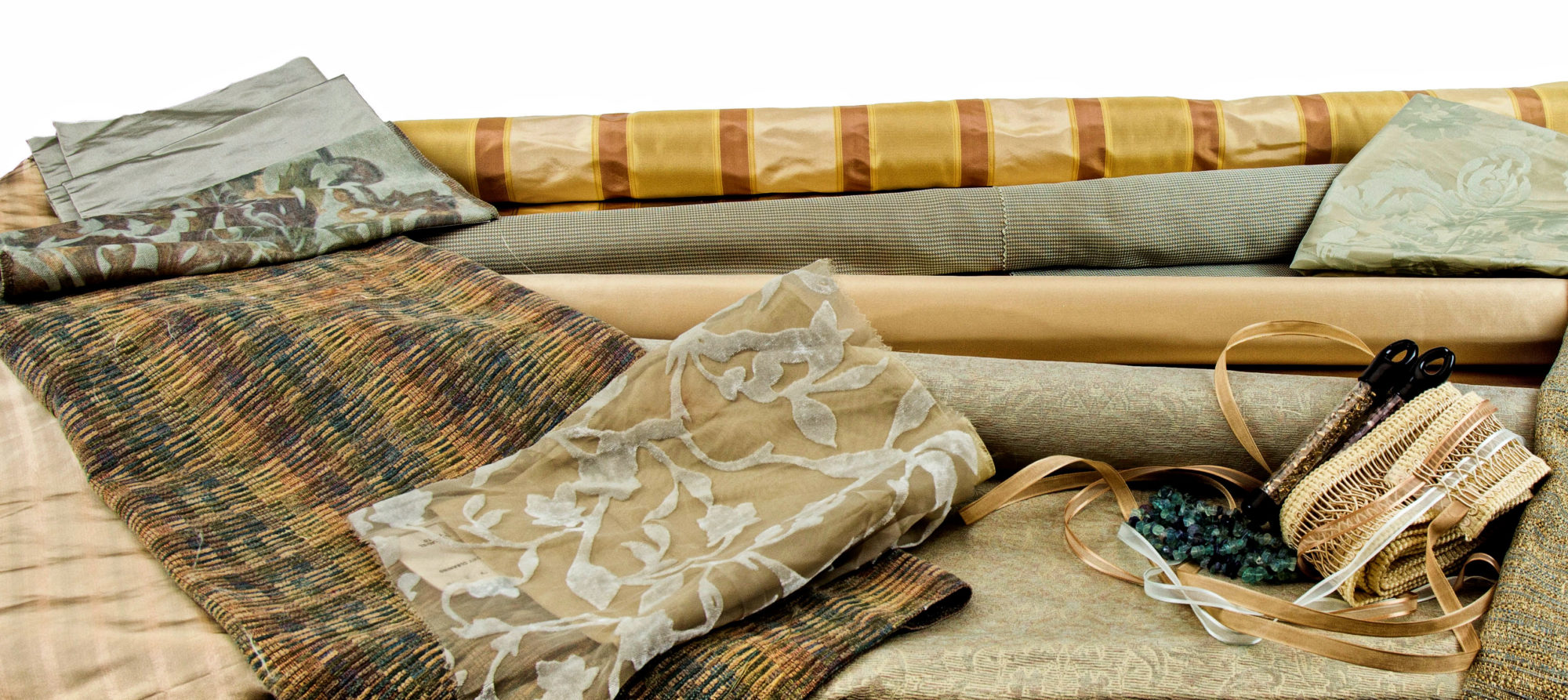
—Let’s make the accent color (turquoise) more integrated into the entry area. How about adding another color for a second accent tone? The table skirt has banding at the bottom in an olive tone…how about a more narrow trim banding in plum or burgundy to begin another color inclusion.
—The entryway floor is a neutral stone and depending on the size of the space an area rug with neutrals, plums, burgundies, olive, and turquoise would create a textural place where all tones come together for a unifying and welcoming design.
—The stairwell has a full tread of solid turquoise carpeting. Depending on the condition of the wood under the carpet a 4-6″ reveal on either side (showing the wood floor) would create interest to the stairwell. Another way to create interest is to use banding at each side of the carpet and should you want to be really bold use banding in a small scale pattern or a combination of the olive/burgundy tones
—How about painting the small alcove wall behind the chair in a soft tone of turquoise or olive…but remember a very soft tone. Change out the kidney pillow on the chair to a fabric combining all the colors we have brought into the space.
—Another way to unify the entryway is with small accessories such as lampshades. How about changing the sconce shades on the stairwell and the shade on the table to a very soft olive silk color. You could even add a narrow burgundy trim for additional impact.
—Go ahead, be creative, remember love is in the details.
For many of us having a lovely entryway/foyer space in our home presents a wonderful design opportunity. The photo of this very colorful and inviting foyer from Traditional Home shows a colorful way to work with the neutrals in the walls and flooring.
The stairwell steps go bold with color and pattern. This stair carpet color acts as a backdrop for the tones in the table skirt and chair in the curved area. Staying in the same color palette as the stairwell carpet, the table and chair fabric show varied and a surprise color of avocado trim on the table skirt.
A real wow for a great first impression is the traditionally styled chair painted a high gloss turquoise to keep the color moving in the curved inset area. Repeating the avocado green accent color in the chair pillow, fresh flowers and art piece on the table creates a sense of warmth. Let your eye go up the stairwell to see the framed botanical pieces with the green again in the botanical design and on the border.
The wall color is lifted from the floor marble and helps move the warm tone of the stairwell up to the second floor. One way to create a seamless/unified look to an area is to have one paint color for all trims in the home. This trim color helps to unify the rooms and create a sense of warmth and flow to the home and the rooms.
Entry areas, no matter how small, create a welcoming area for your guest. Go ahead, be creative and have this small space reflect you and your home.