Too Much Green…What can I do????

A blog reader e-mailed me (see “Contact” on the website) this photo from Elle Décor Magazine where the reader wanted to use some of these ideas for her vacation home. Loving green on the walls and upholstery pieces she had concerns might be too much of a good thing and what other options could she consider?

Photo from Elle Decore Magazine

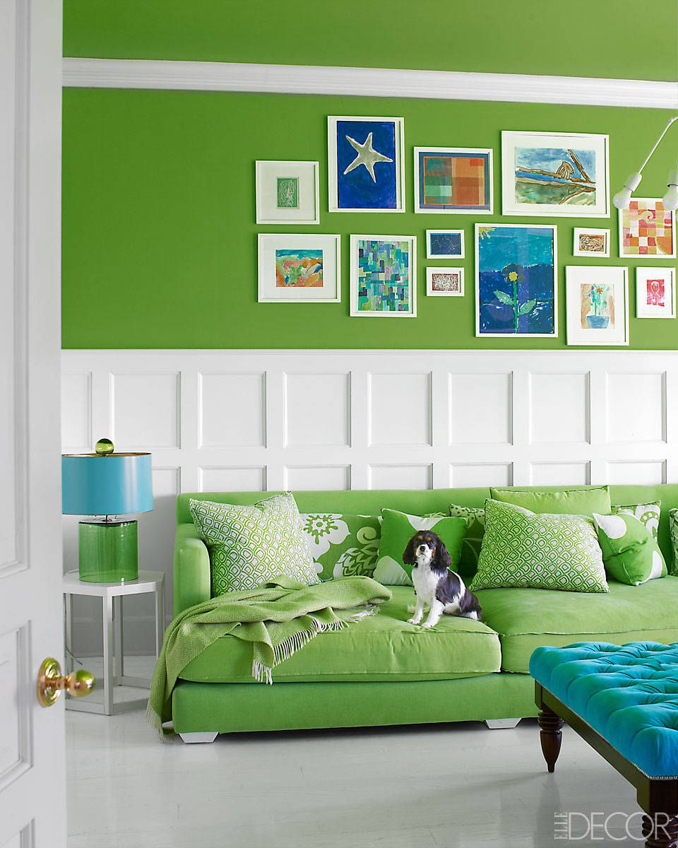
This is such a great room with many wonderful design elements…just a little tweaking is needed. Let’s begin with the “envelope” of the room which includes walls, ceiling, and flooring. Beginning with the walls there is the upper green wall in two sections and the ceiling which we are not able to see. The lower wall wainscoting and solid surface flooring are light in color/white while the upper walls and sofa are medium intensity green making the room feel a bit top-heavy …the green color visually “weighing” more than the white. The upper wall white trim piece could be removed making the upper green wall visually one piece with the lower white wainscoting in better proportion to the green wall area….and rather than a stark white paint color…a softer warmer white tone will act as a backdrop enhancing the green color tone.

It is difficult to tell if the floor is painted or has a laminated finish over it. Regardless, the bright white as currently shown is very strong plus having a shiny finish reflects not only the exterior sunlight but also the lighting in the room. If you change the floor material/color why not add an area rug with texture and additional color tones. Bringing in your favorite colors which might include terra cotta, golden colors or rich lavender/plum tones adds warmth and interest to the space.

Lighting is so important for reading and just to create mood to the room. The small end table next to the sofa might be taller with the lamp being more “artful” …adding an element of texture and surprise to the space. How about taking the green throw from the sofa and casually tossing it over a corner of the upholstered ottoman/coffee table?
Now we have a wall behind the sofa that is tall (we previously deleted the top trim piece) and ready for some wall art and creative design. Larger art pieces above the wainscoting (lower white wall trim area) will be more impactful than many small pieces. Since the wall area is quite large several pieces and sizes could be relocated here. Why not add the small art pieces currently on the green/art wall to the top layer of the “squared” wainscoting?? This acts as a transition from the larger pieces of the upper wall to the smaller sections within the wainscoting. Be certain to put pieces about the same size and scale in this location.

A client of mine asked, “Where should I put pillows in my room?” The answer is EVERYWHERE!!! Reviewing the pillow grouping on the sofa additional pattern and color could be included along with those currently on the sofa. Pillow Galleria has two wonderful selections…Animal Whimsey and Brights and Stripes would add drama and color to the space. Should these selections not be right for you, add pillows and accessories with color brights and drama that work for you!!!

Go ahead, be creative, show your inner designer!!!

Please follow and like us:

Living Coral for Spring 2019 – Pantone Color of the Year

photo credit www.pantone.com

Pantone is the bible of color for all products, fashion, interior design and most everything having to do with color, and it has named “Living Coral” as the color of the year. It is the color of underwater reefs, and the sky at dusk. Laurie Pressman, Pantone’s Vice President, considers this saturated orange base with a golden undertone not only warm and welcoming but life-affirming. We want colors that make us feel good…not too heavy. We want to feel uplifted. It is emotional nourishment.” Look forward to your favorite products in the new “Living Coral” color.

Go ahead, be creative. Let your imagination run wild. Remember love is in the details.

Please follow and like us:

Bold Design & Bold Paint Colors for a Bold Bedroom Space.


Who says bedrooms must be done in pastels. This master bedroom brings many bold ideas together for a strong but restful space. Although the square footage for this room is not large, the bold patterns and colors create a welcoming environment.

Let’s take a closer look at each of the components. Pattern Mixing which includes wallcovering, drapery fabric, plaid bed throw plus the chair fabric is the strongest message from this room.

Design patterns of the wall covering and drapery fabric both have a similar curved design which creates continuity in the room. The addition of the red in the drapery fabric adds spice and warmth to the space plus it gives other areas of the room more colors to use.  

The mahogany colored bed frame is replicated in the ceiling, window, and fireplace trims. This creates a warm and cohesive feeling with the paint color being the “binder” feeling to the room. Now we can go forward with additional creativity. The plaid throw on the bed is a wonderful pattern mix to the other room colors and adds a little bit of “wow.” Don’t be afraid to mix plaids, florals, botanical or contemporary designs together. The key is the color groupings need to be similar.

The feeling of the room is traditional which is highlighted with the gold drapery hardware along with the mirror frame style. The addition of the traditional chest next to the bed is another nod to a traditional/eclectic space. But what might we change creating a more cohesive space? How about painting the ceiling color a very soft ivory/beige or maybe a soft gray/beige depending on the actual colors in the wallcovering for additional depth to the room? And although we cannot see the entire bed area…. more pillows created from the many colors in the room would be a good place to gather patterns and tones.


Addressing the seating area near the fireplace we see a warm and cozy area to read, have a glass of wine, and enjoy time before bed. Although all the wonderful elements from the bed area have mostly been replicated, a few changes might be made. Depending on budget, the etagere/bookcase to the right of the fireplace could appear to have a more custom look. A custom piece would be the entire width of the alcove although not necessarily the full height. A replication of the bed trim/color design might be incorporated plus gold tone touches from the drapery/mirror hardware as well as using details of the wallcovering thus creating a custom wall alcove with all the special design details of the room.   

The fabric on the chairs at the end of the bed might be changed out to be a stronger color tone and more in line with the colors already in the room. Perhaps an intensity (strength of color) more in line with other tones in the room would add to a feeling of consistency.

And of course, a few books, a dazzling fire and a glass of wine create a room for retiring. Go ahead, be creative and give each of your rooms your own design styles.

Please follow and like us: