Primary Pops of Color with Kaleidoscope

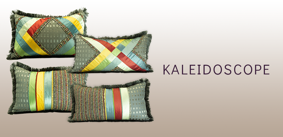
Many rooms in our homes have the right “bones” …they just need the right accessories. A pop of bright primary colors softened by a neutral gray could be just the answer. Two photos of very different living spaces show the design range Kaleidoscope can enhance.

John Merkl | Traditional Homes

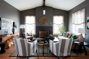
The first photograph from Traditional Home has walls painted in a medium intensity gray. Although the room is well laid out using only white and gray color tones, a pop of “energy” is needed. This space combines a textural grouping of eclectic items such as the hand-carved wood sofa table in warm yellow tones on the left wall lending a sense of warmth to the room.

Additional materials from nature including the art piece hanging over the fireplace, the stone/metal side table plus other smaller eclectic items throughout the room bring texture and nature together to create an interesting feel to the space. With the addition of Kaleidoscope designer pillows, the nature/neutrals of the room will have yet another accessory accenting the gray tones with primary colors coming together for a real POP!!!

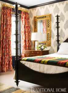
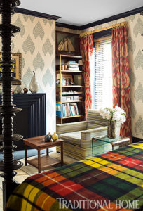
The second room again from Traditional Home designed in neutral white is a perfect backdrop for colorful accessory ideas. The lines of this richly designed traditional living space with black accents could enjoy some color… the set of Kaleidoscope pillows is the answer. The cleaner lines of the sofas and side tables create a welcomed backdrop for the room’s architectural drama plus the unexpected surprise of the gold/black chairs anchoring the rear of the room. The tall brass lamps near the chairs add another level of boldness with the black shades. The matching sofas on the left and right in the room have a set of comfy pillows and by placing a pair of Kaleidoscope pillows on each sofa we are adding another element of interest to the middle of the room.


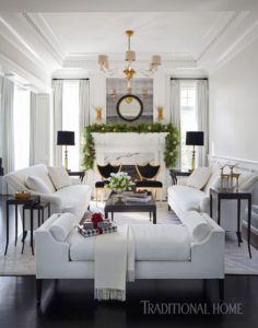
Notice the fireplace surround is a Carrera gray stone and the mirror over the fireplace is in darker gray tones again supporting varied intensities found in the room. The sconces on the fireplace are in brass carrying through the warmth brass accessories in the room. Who says a neutral room needs to be boring….it is the accessories and the placement which make the difference!!!

Go ahead, be creative. Let your imagination run wild. Remember love is in the details.

Bold Design & Bold Paint Colors for a Bold Bedroom Space.


Who says bedrooms must be done in pastels. This master bedroom brings many bold ideas together for a strong but restful space. Although the square footage for this room is not large, the bold patterns and colors create a welcoming environment.

Let’s take a closer look at each of the components. Pattern Mixing which includes wallcovering, drapery fabric, plaid bed throw plus the chair fabric is the strongest message from this room.

Design patterns of the wall covering and drapery fabric both have a similar curved design which creates continuity in the room. The addition of the red in the drapery fabric adds spice and warmth to the space plus it gives other areas of the room more colors to use.  

The mahogany colored bed frame is replicated in the ceiling, window, and fireplace trims. This creates a warm and cohesive feeling with the paint color being the “binder” feeling to the room. Now we can go forward with additional creativity. The plaid throw on the bed is a wonderful pattern mix to the other room colors and adds a little bit of “wow.” Don’t be afraid to mix plaids, florals, botanical or contemporary designs together. The key is the color groupings need to be similar.

The feeling of the room is traditional which is highlighted with the gold drapery hardware along with the mirror frame style. The addition of the traditional chest next to the bed is another nod to a traditional/eclectic space. But what might we change creating a more cohesive space? How about painting the ceiling color a very soft ivory/beige or maybe a soft gray/beige depending on the actual colors in the wallcovering for additional depth to the room? And although we cannot see the entire bed area…. more pillows created from the many colors in the room would be a good place to gather patterns and tones.


Addressing the seating area near the fireplace we see a warm and cozy area to read, have a glass of wine, and enjoy time before bed. Although all the wonderful elements from the bed area have mostly been replicated, a few changes might be made. Depending on budget, the etagere/bookcase to the right of the fireplace could appear to have a more custom look. A custom piece would be the entire width of the alcove although not necessarily the full height. A replication of the bed trim/color design might be incorporated plus gold tone touches from the drapery/mirror hardware as well as using details of the wallcovering thus creating a custom wall alcove with all the special design details of the room.   

The fabric on the chairs at the end of the bed might be changed out to be a stronger color tone and more in line with the colors already in the room. Perhaps an intensity (strength of color) more in line with other tones in the room would add to a feeling of consistency.

And of course, a few books, a dazzling fire and a glass of wine create a room for retiring. Go ahead, be creative and give each of your rooms your own design styles.

Small Room Design: Bold Patterns in Small Spaces

Image: House Beautiful Magazine

Many of us were taught design options for small rooms such as a powder room were limited to neutral paint colors and small wall covering patterns.

As times and designs have changed, so have these tired design ideas. Many homes now are being built or remodeled with the powder room used as a guest toilette area with bathrooms used for the family members.

Our blog photo from House Beautiful shows a powder room which rejects all the old design tenants replacing them with new bold colors and strong wall covering patterns.

  • Color selections are also updated using leaf green, eggplant and Tiffany blue creating the basic palette.
  • The tones in the wall covering are cooler meaning there is less warm or yellow/orange in the color range and the tones are very clear and clean.

Details are what make a small room design a success or not. This is where hiring a design consultant for a few hours will help create a true design success.

Where might I go wrong you ask…

  • Consider the selection of the stone sink surround, the fixtures, sink cabinet and sconces.  If visualizing the big picture of the finished space doesn’t come easily for you, you may choose these items based on your color and finish preference.  Perhaps you like a warm beige stone and oil rubbed bronze fixtures. If these choices are selected, you have a small space with both warm and cool tones creating a non-cohesive feeling.
  • A large-scale wall covering print in a small space creates a sense of warmth. A small-scale print feels busier and a little claustrophobic. Our design goal is a feeling of warmth and inclusion.  Each room has an atmosphere…. a message to those who enter…about its purpose.

Remember to let the space/room convey to your guest a sense of welcome. Go ahead, be creative and create your own splendor in a small space. Remember love is in the details!!